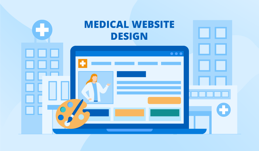
Having a mobile-friendly website is very important if you want to attract more mobile visitors. This is because more than 50% of all internet traffic comes from mobile devices. Your healthcare website design should be responsive to mobile devices and offer a comfortable online experience. However, many healthcare websites do not offer mobile-responsive design.
Mobile-responsive
The ability to provide a consistent experience across devices and platforms is critical in the healthcare industry. The development of a mobile-responsive healthcare website can help you provide the same level of service to patients no matter how they use their device. But a responsive website is not as common as it should be.
A mobile-responsive healthcare website design will respond to the device being used to access it and present content in a way that is most comfortable to the user. This type of website is also more likely to get a high ranking in search engine results, which is crucial to maintaining trust and credibility. Recent research shows that up to seventy percent of people make a judgment on a business based on its website.
Clean
A healthcare website should have a professional look. The website design has a big impact on how people feel about your organization. It’s important to use limited color schemes, fonts, and designs to avoid overwhelming your website visitors. Use branded colors, incorporate white space, and keep on-page elements simple.
A good healthcare website design should make it easy to navigate. You shouldn’t have to retype the navigation or resize images. This approach allows you to keep a consistent style. For example, the Good Shepherd Healthcare website features an intuitive navigation bar and highlights important pages with buttons. It also includes contact information and a drop-down menu of specialties.
Uncluttered
When designing a healthcare website, it’s crucial to use an uncluttered approach. Try to avoid using outdated design trends and avoid cluttered homepages, contact information, and testimonials. You also need to avoid using fonts and color schemes that are hard to read. Finally, avoid using spammy styles and layouts.
Healthcare websites should feature a simple navigation menu and minimal content. They should also use two web-friendly fonts and contrast colors to make them stand out. Also, make sure that the call to action is the only element above the fold.
Call to action
Providing a call to action on your healthcare website is one way to engage patients, prospects, and donors. A prominent CTA button will direct visitors to the right page. This makes it easier for them to navigate your site. It also appeals to the typical intentions of a website visitor.
The main focus of a healthcare website should be to give visitors the information they need to make an informed decision about their healthcare. This means providing vital information, such as location, phone number, and contact information. It is also important to incorporate interactive features, such as a patient portal, which allows users to monitor their health data. Interactive features will boost user experience and influence the bounce rate and click-through rates of the website.
Hub page
A Hub page on a healthcare website can make the content more accessible. The information presented on it should be easy to find, and it should be easy for visitors to schedule appointments. It should also be included in search results and the provider directory. A web developer can build this functionality for you, or you can use patient scheduling software.
A hub page should contain articles, videos, pictures, and other media that are relevant to the topic. It should also include links to related subtopics. A well-written hub page can help you establish your authority in the field and increase your traffic.


